One More Sec

OVERVIEW

A student-centered wellness brand designed to help college students at University of North Carolina at Charlotte build healthier relationships with time, productivity, and rest. one more sec uses real student data to reframe balance as something achievable—not aspirational.

YEAR

2025

ROLE

User Research & Insight Synthesis
Product Strategy & Concept Development
Wireframing & User Flows
UI Design & Design System
Prototyping

SERVICES

UX Research & Strategy
Product Design (UX/UI)
Interaction Design
Information Architecture
Visual Design System

About the project

The Challenge

College students often struggle to balance academic demands with their mental well-being. Traditional productivity tools prioritize efficiency and output, leaving little room for rest or recovery. As a result, students feel overwhelmed, burned out, and unsure how to manage their time in a sustainable way.
User Research

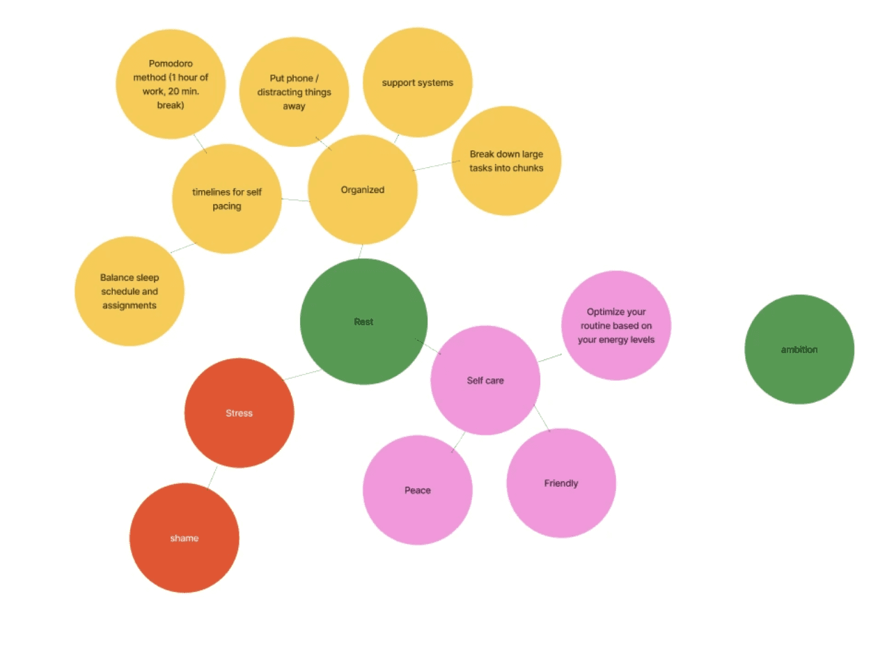
Research was conducted using insights from students, faculty, and leadership at University of North Carolina at Charlotte. Key findings revealed that students:

  • Feel pressure to always be productive

  • Struggle with inconsistent schedules and time management

  • Experience guilt when taking breaks

  • Lack tools that support both productivity and well-being

These insights informed a key opportunity: design a system that doesn’t just track time, but helps students build healthier relationships with it.


User Journey

The experience is designed to support students throughout their day, not just during planning moments.

  • Planning: Users input tasks, deadlines, and priorities into a flexible schedule

  • Balancing: The system suggests realistic time blocks, including built-in breaks

  • Awareness: Visual feedback helps users understand how their time is distributed

  • Adjustment: Users can easily adapt their schedule as plans change

  • Reflection: End-of-day or weekly summaries reinforce progress and encourage rest

This journey reframes productivity as a cycle: plan, act, rest, and reset rather than a constant push forward.
Prototyping

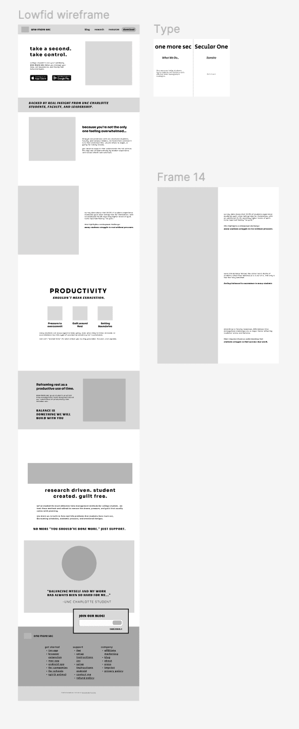
Wireframes and prototypes focused on clarity, flexibility, and low cognitive load. Early iterations explored:

  • Simplified scheduling interfaces to avoid overwhelm

  • Visual indicators for workload and energy levels

  • Subtle nudges encouraging breaks and recovery

  • Modular layouts that adapt to changing schedules

User flows were refined to minimize friction, ensuring that adding, adjusting, or removing tasks felt quick and intuitive rather than burdensome.

The final interface presents a clean, structured system for an app that balances control with flexibility. A clear visual hierarchy guides users through their schedule while integrated prompts encourage healthier habits.

Key features include:

  • Adaptive scheduling that adjusts to real-life changes

  • Built-in rest prompts based on workload

  • Visual time breakdowns for increased awareness

  • A calm, approachable design language that reduces stress

The result is a landing page responsive to web and mobile for a tool that supports productivity without reinforcing burnout helping students feel more in control of their time, energy, and overall well-being.


Tap to View Walkthrough Below!

Smooth Scroll
This will hide itself!

One More Sec

OVERVIEW

A student-centered wellness brand designed to help college students at University of North Carolina at Charlotte build healthier relationships with time, productivity, and rest. one more sec uses real student data to reframe balance as something achievable—not aspirational.

YEAR

2025

ROLE

User Research & Insight Synthesis
Product Strategy & Concept Development
Wireframing & User Flows
UI Design & Design System
Prototyping

SERVICES

UX Research & Strategy
Product Design (UX/UI)
Interaction Design
Information Architecture
Visual Design System

About the project

The Challenge

College students often struggle to balance academic demands with their mental well-being. Traditional productivity tools prioritize efficiency and output, leaving little room for rest or recovery. As a result, students feel overwhelmed, burned out, and unsure how to manage their time in a sustainable way.

User Research

Research was conducted using insights from students, faculty, and leadership at University of North Carolina at Charlotte. Key findings revealed that students:

  • Feel pressure to always be productive

  • Struggle with inconsistent schedules and time management

  • Experience guilt when taking breaks

  • Lack tools that support both productivity and well-being

These insights informed a key opportunity: design a system that doesn’t just track time, but helps students build healthier relationships with it.


User Journey

The experience is designed to support students throughout their day, not just during planning moments.

  • Planning: Users input tasks, deadlines, and priorities into a flexible schedule

  • Balancing: The system suggests realistic time blocks, including built-in breaks

  • Awareness: Visual feedback helps users understand how their time is distributed

  • Adjustment: Users can easily adapt their schedule as plans change

  • Reflection: End-of-day or weekly summaries reinforce progress and encourage rest

This journey reframes productivity as a cycle: plan, act, rest, and reset rather than a constant push forward.

Prototyping

Wireframes and prototypes focused on clarity, flexibility, and low cognitive load. Early iterations explored:

  • Simplified scheduling interfaces to avoid overwhelm

  • Visual indicators for workload and energy levels

  • Subtle nudges encouraging breaks and recovery

  • Modular layouts that adapt to changing schedules

User flows were refined to minimize friction, ensuring that adding, adjusting, or removing tasks felt quick and intuitive rather than burdensome.

The final interface presents a clean, structured system for an app that balances control with flexibility. A clear visual hierarchy guides users through their schedule while integrated prompts encourage healthier habits.

Key features include:

  • Adaptive scheduling that adjusts to real-life changes

  • Built-in rest prompts based on workload

  • Visual time breakdowns for increased awareness

  • A calm, approachable design language that reduces stress

The result is a landing page responsive to web and mobile for a tool that supports productivity without reinforcing burnout helping students feel more in control of their time, energy, and overall well-being.


Tap to View Walkthrough Below!

Smooth Scroll
This will hide itself!

One More Sec

OVERVIEW

A student-centered wellness brand designed to help college students at University of North Carolina at Charlotte build healthier relationships with time, productivity, and rest. one more sec uses real student data to reframe balance as something achievable—not aspirational.

YEAR

2025

ROLE

User Research & Insight Synthesis
Product Strategy & Concept Development
Wireframing & User Flows
UI Design & Design System
Prototyping

SERVICES

UX Research & Strategy
Product Design (UX/UI)
Interaction Design
Information Architecture
Visual Design System

About the project

The Challenge

College students often struggle to balance academic demands with their mental well-being. Traditional productivity tools prioritize efficiency and output, leaving little room for rest or recovery. As a result, students feel overwhelmed, burned out, and unsure how to manage their time in a sustainable way.

User Research

Research was conducted using insights from students, faculty, and leadership at University of North Carolina at Charlotte. Key findings revealed that students:

  • Feel pressure to always be productive

  • Struggle with inconsistent schedules and time management

  • Experience guilt when taking breaks

  • Lack tools that support both productivity and well-being

These insights informed a key opportunity: design a system that doesn’t just track time, but helps students build healthier relationships with it.


User Journey

The experience is designed to support students throughout their day, not just during planning moments.

  • Planning: Users input tasks, deadlines, and priorities into a flexible schedule

  • Balancing: The system suggests realistic time blocks, including built-in breaks

  • Awareness: Visual feedback helps users understand how their time is distributed

  • Adjustment: Users can easily adapt their schedule as plans change

  • Reflection: End-of-day or weekly summaries reinforce progress and encourage rest

This journey reframes productivity as a cycle: plan, act, rest, and reset rather than a constant push forward.

Prototyping

Wireframes and prototypes focused on clarity, flexibility, and low cognitive load. Early iterations explored:

  • Simplified scheduling interfaces to avoid overwhelm

  • Visual indicators for workload and energy levels

  • Subtle nudges encouraging breaks and recovery

  • Modular layouts that adapt to changing schedules

User flows were refined to minimize friction, ensuring that adding, adjusting, or removing tasks felt quick and intuitive rather than burdensome.

The final interface presents a clean, structured system for an app that balances control with flexibility. A clear visual hierarchy guides users through their schedule while integrated prompts encourage healthier habits.

Key features include:

  • Adaptive scheduling that adjusts to real-life changes

  • Built-in rest prompts based on workload

  • Visual time breakdowns for increased awareness

  • A calm, approachable design language that reduces stress

The result is a landing page responsive to web and mobile for a tool that supports productivity without reinforcing burnout helping students feel more in control of their time, energy, and overall well-being.


Tap to View Walkthrough Below!

Smooth Scroll
This will hide itself!

Create a free website with Framer, the website builder loved by startups, designers and agencies.