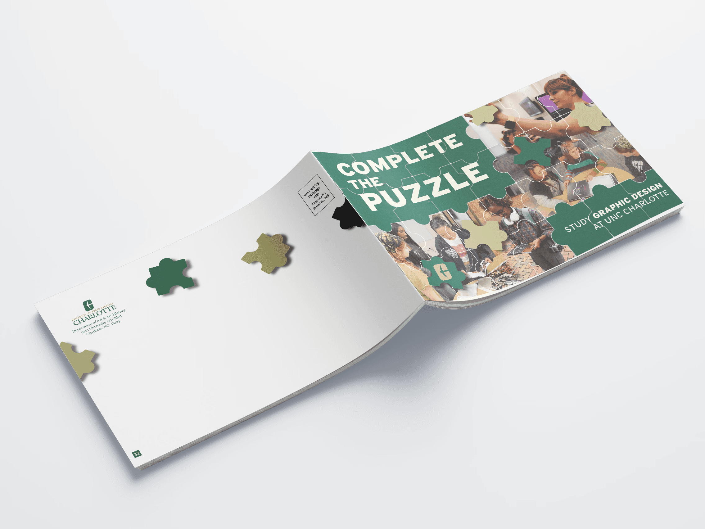
“Complete the Puzzle” reframes graphic design as something you build over time not something you arrive at fully formed. The concept uses puzzle pieces as a visual and narrative device to show how ideas, skills, and experiences gradually come together to shape a designer.
The catalog speaks directly to high school seniors and incoming students who are curious, creative, and still figuring things out. Instead of presenting design as polished and perfect, the layouts highlight the process: messy sketches, in-progress work, and real studio environments. The goal is to make the experience feel approachable and human, allowing readers to see themselves in it.
Visually, puzzle-piece framing and layered compositions create moments of interaction throughout the spreads, reinforcing the idea of connection and discovery. A structured, bold typeface is paired with more expressive elements to balance clarity with personality. The color palette draws from the university’s identity, grounding the concept while still feeling fresh and energetic.
The project also extends beyond visuals into production thinking. A complete book map, folding dummy, and press sheet imposition were developed to ensure the catalog functions as a real, printable object while meeting mailing specifications, staying within budget, and maximizing press efficiency.